E-Commerce Platform
KOKOLOCO is a Qatar-based e-commerce application that links designers directly with customers.
My Role
User Research, UI Design, Usability Testing, Prototyping.
September ,2022 - February ,2023
Results
Successfully launched the amin and vendor portal.


Objective
The primary goal was to enhance user satisfaction and streamline user interactions through a more user-friendly and aesthetically pleasing UI.
Our project aimed to elevate the user experience by undertaking a comprehensive redesign of the user interface (UI). Faced with usability challenges and outdated design elements, we set out to create a more intuitive and visually appealing UI that aligns with modern design principles.
Redesigning UI for Enhanced User Experience
The Process
We have done the UI audit and UX audit of the portal.
UI Audit : In UI audit we have worked on finding all the discrepancies in the platform. We have set up the visual direction of the portal and also maintain the consistency with the website and application.
UX Audit : In UX audit we have worked understanding the user flows, did user research and also user testing.
Redesigning UI for Enhanced User Experience


Old Order List UI
New Order List UI
After UI audit of the application we have found that
Current UI looks cluttered
Space has not been used properly.
Use of unnecessary illustrations, that’s not adding any value to the design.
The navigation bar is oversized as it does not incorporate the necessary data in the table.
Implemented a modern and cohesive visual design, incorporating contemporary color schemes, typography, and iconography. Ensured consistency across the entire UI for a polished look.
Design minimalist dashboard UI that includes all the new functionality include filter, sort and download report feature.
Added all the required data in the table.
Changed navigation bar design to facilitate data.
New Feature Introduction
Download data
Add filter.
Add sort action.
Include additional data in the table obtained from the user interviews.


Old Order Details UI
After UI audit of the application we have found that
UI is missing important information
Customer Details and order details are not segregated properly.
New Order Details UI
New Order UI includes
Order ID
Sections are segregated properly.


Design System
a design system serves as a centralized and structured resource that empowers teams to create high-quality, coherent, and salable designs while fostering collaboration and efficiency throughout the design and development life cycle.
Takeaways
Understanding the back-office operation of the application was difficult, but with the help of project manager I was able to come up with the information architecture and user journey. Once we have established the wire-frame, we could easily work on the design and deliver project successfully.


A Definitive Community for Global SaaS

The first EventOps and intelligence platform


Outsourcing Platformfor Startups

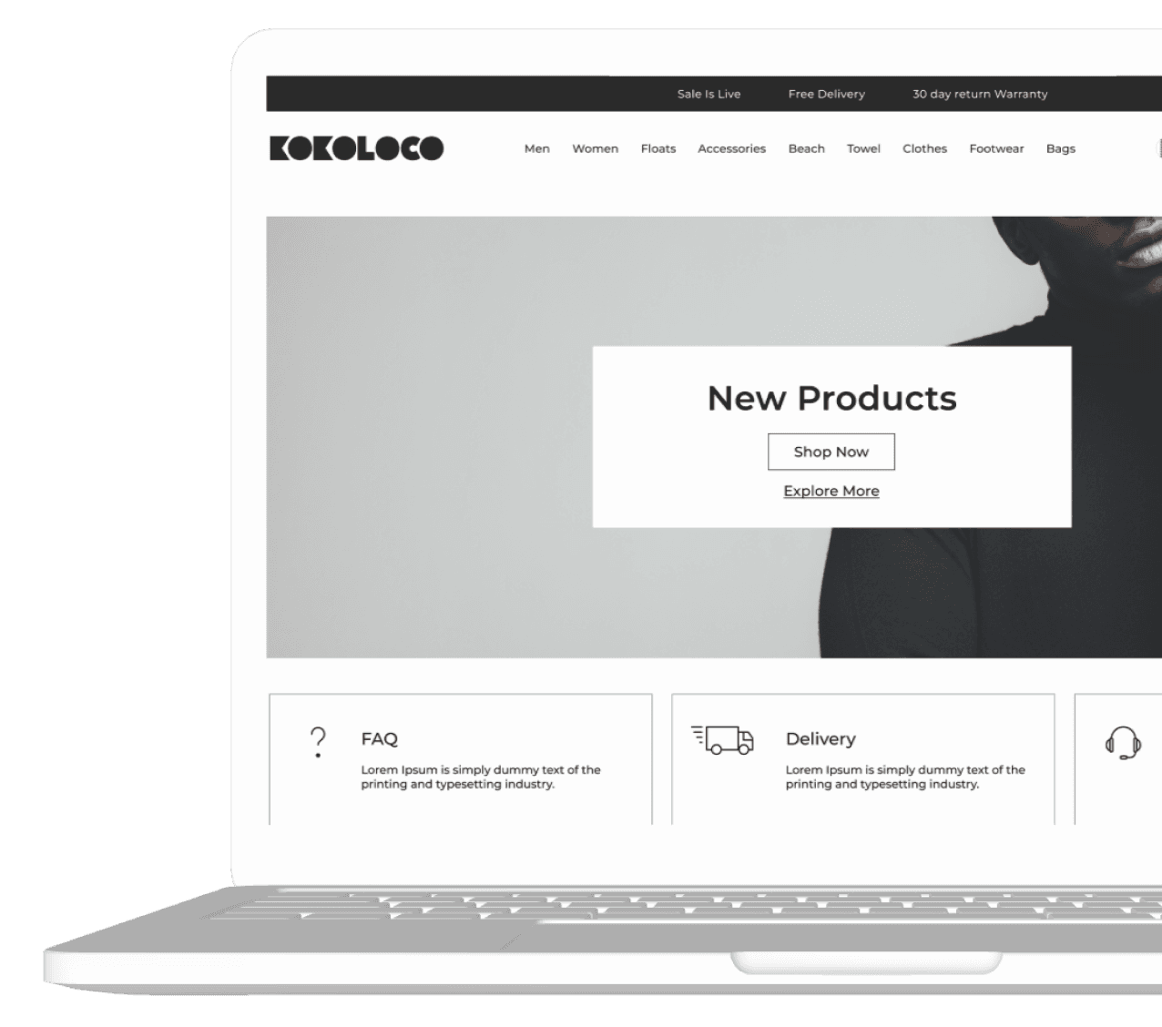

E-Commerce Platform - Design Website and Application
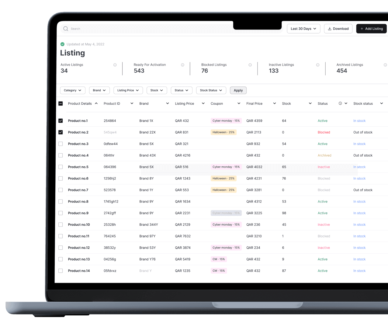
E-Commerce Platform - Admin and Vendor Design
E-Commerce Platform
KOKOLOCO is a Qatar-based e-commerce application that links designers directly with customers.
My Role
User Research, UI Design, Usability Testing, Prototyping.
September ,2022 - February ,2023
Results
Successfully launched the amin and vendor portal.


Objective
The primary goal was to enhance user satisfaction and streamline user interactions through a more user-friendly and aesthetically pleasing UI.
Our project aimed to elevate the user experience by undertaking a comprehensive redesign of the user interface (UI). Faced with usability challenges and outdated design elements, we set out to create a more intuitive and visually appealing UI that aligns with modern design principles.
Redesigning UI for Enhanced User Experience
The Process
We have done the UI audit and UX audit of the portal.
UI Audit : In UI audit we have worked on finding all the discrepancies in the platform. We have set up the visual direction of the portal and also maintain the consistency with the website and application.
UX Audit : In UX audit we have worked understanding the user flows, did user research and also user testing.
Redesigning UI for Enhanced User Experience


Old Order List UI
New Order List UI
After UI audit of the application we have found that
Current UI looks cluttered
Space has not been used properly.
Use of unnecessary illustrations, that’s not adding any value to the design.
The navigation bar is oversized as it does not incorporate the necessary data in the table.
Implemented a modern and cohesive visual design, incorporating contemporary color schemes, typography, and iconography. Ensured consistency across the entire UI for a polished look.
Design minimalist dashboard UI that includes all the new functionality include filter, sort and download report feature.
Added all the required data in the table.
Changed navigation bar design to facilitate data.
New Feature Introduction
Download data
Add filter.
Add sort action.
Include additional data in the table obtained from the user interviews.


Old Order Details UI
After UI audit of the application we have found that
UI is missing important information
Customer Details and order details are not segregated properly.
New Order Details UI
New Order UI includes
Order ID
Sections are segregated properly.


Design System
a design system serves as a centralized and structured resource that empowers teams to create high-quality, coherent, and salable designs while fostering collaboration and efficiency throughout the design and development life cycle.
Takeaways
Understanding the back-office operation of the application was difficult, but with the help of project manager I was able to come up with the information architecture and user journey. Once we have established the wire-frame, we could easily work on the design and deliver project successfully.


A Definitive Community for Global SaaS

The first EventOps and intelligence platform


Outsourcing Platformfor Startups


E-Commerce Platform - Design Website and Application

E-Commerce Platform - Admin and Vendor Design
E-Commerce Platform
KOKOLOCO is a Qatar-based e-commerce application that links designers directly with customers.
My Role
User Research, UI Design, Usability Testing, Prototyping.
September ,2022 - February ,2023
Results
Successfully launched the amin and vendor portal.


Our project aimed to elevate the user experience by undertaking a comprehensive redesign of the user interface (UI). Faced with usability challenges and outdated design elements, we set out to create a more intuitive and visually appealing UI that aligns with modern design principles.
Objective
The primary goal was to enhance user satisfaction and streamline user interactions through a more user-friendly and aesthetically pleasing UI.
Redesigning UI for Enhanced User Experience
The Process
We have done the UI audit and UX audit of the portal.
UI Audit : In UI audit we have worked on finding all the discrepancies in the platform. We have set up the visual direction of the portal and also maintain the consistency with the website and application.
UX Audit : In UX audit we have worked understanding the user flows, did user research and also user testing.
Redesigning UI for Enhanced User Experience

Old Order List UI
After UI audit of the application we have found that
Current UI looks cluttered
Space has not been used properly.
Use of unnecessary illustrations, that’s not adding any value to the design.
The navigation bar is oversized as it does not incorporate the necessary data in the table.
New Feature Introduction
Download data
Add filter.
Add sort action.
Include additional data in the table obtained from the user interviews.
New Order List UI
Implemented a modern and cohesive visual design, incorporating contemporary color schemes, typography, and iconography. Ensured consistency across the entire UI for a polished look.
Design minimalist dashboard UI that includes all the new functionality include filter, sort and download report feature.
Added all the required data in the table.
Changed navigation bar design to facilitate data.

Old Order Details UI
After UI audit of the application we have found that
UI is missing important information
Customer Details and order details are not segregated properly.

New Order Details UI
New Order UI includes
Order ID
Sections are segregated properly.


Design System
a design system serves as a centralized and structured resource that empowers teams to create high-quality, coherent, and salable designs while fostering collaboration and efficiency throughout the design and development life cycle.
Takeaways
Understanding the back-office operation of the application was difficult, but with the help of project manager I was able to come up with the information architecture and user journey. Once we have established the wire-frame, we could easily work on the design and deliver project successfully.

The first EventOps and intelligence platform


A Definitive Community for Global SaaS

E-Commerce Platform - Admin and Vendor Design


Outsourcing Platformfor Startups


E-Commerce Platform - Design Website and Application